Buzzes and Fizzes - Esri User Conference 2014
A brilliant sunny day in London was a chance to recharge enthusiasm for GIS and learn about some startling new applications of the technology.
On the wall of one of the reception rooms of the QEII conference centre is an immense wooden sculpture. Entitled ‘On the Island’, it is the work of Sir Edualdo Paolozzi, born in Scotland of Italian parents. Created in 1986, the work is a mass of geometrical shapes that, for our community, serve as an easy metaphor for what today’s 3D city GIS can achieve. Alas, the full benefit of this remarkable work to delegates at Esri UK’s annual user conference was partially hidden by sponsors’ stands!
There are times when all of us involved in GI need a day out at an event to recharge our batteries and reignite the spark of enthusiasm for what we know GI can do. Esri’s user event was indeed a great day out.
The conference attracted well over 1000 delegates and was the best attended the company has run in the UK. Whether this was the agenda, the venue in the heart of Westminster or the lovely spring weather may remain a mystery.
As with all of these events, there are hard choices for the attendee. Ten tracks all offered something tempting but I settled down to Exploring Mobile Solutions.
Wet Apps
After a quick rundown from Matt Jones and Emma Sandison on the capabilities of Esri’s latest mobile platform with its critical Syncing, Explorer and Collector features, we were off on a trip down the Scottish Canals via the Falkirk Wheel, a massive boatlift and tourist attraction in lieu of a series of locks for the canal’s steep gradient.
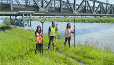
From canals we stayed in the wet but this time with Severn Trent Water, the fourth largest water utility in the world with over 140,000km of pipes. Like most water companies, Severn Trent has poor confidence in its existing mapping and is engaged in an ongoing data collection and correction exercise as field crews expose old mains, valves, manholes and hydrants to fix leaks and renew the network.
Nick Williams, the company’s project manager for information systems, explained how in the space of six months they have equipped over 1000 field workers with tablets running the latest Esri mobile GIS platform integrated with the utility’s central work management system. External contractors also have to use the same system. The tablets can communicate with a central server to accept updates from Ordnance Survey’s MasterMap (10Gb of data for Severn Trent’s area) so field workers have the most up-to-date mapping.
Williams explained how they proceeded cautiously beginning with developing the business case; design and configuration. Next there were field trials amongst the workforce to get feedback on functionality; testing and finally roll-out. Lessons learned from the programme included the importance of functionality to field workers with an understandable fear of automation and dealing with the cloud.
90% is Spatial
Making GIS available across an organization brings many benefits, some less obvious in advance. Typical are local authorities which have many disparate departments but with a spatial element present in up to 90% of their activities. Julie Seddon of Wiltshire Council, a unitary authority but with 20 local community boards, explained how GIS is now available via an intranet to some 5000 people including the police and elected members who serve an area with a population of over 470,000 (of which 31,000 are in the Army).
Seddon, who carries the rather convoluted title of Solutions Manager – Spatial Information Business Solutions, explained how her team of ten studied the workflows of the Highways department before setting up training sessions for the enterprise’s workforce, gaining feedback before field trials. Key areas for the new system were drainage, fixed assets and play areas. Once in operation, Seddon estimates savings of £275k over a five-year period for Highways; she is keen to move on to other council departments like Emergency Planning and Elections.
Spatial analysis using data from a GIS, as we all should know, can help solve many problems and answer questions about the real world. It can detect patterns, change and help make sense of complex networks. It also has the potential, if presented clearly and simply and with reliable data, to provide ordinary citizens with a clear source of information and a vivid picture of reality to help engagement with government and officials.
With this in mind, Alice Duff and Claire Inkpen delivered a session titled Realising the value of Spatial Analysis. There was much talk of ‘story maps’, an Esri favourite at the moment and featured by Jack Dangermond last autumn in his lecture when he received the British Cartographical Society’s Medal (see the December 2013 issue of GiSPro).
Finding the Right School
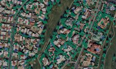
The benefits of this approach are probably no better seen than in the Greater London Authority’s Schools Atlas project, which has delivered an online map showing all the capital’s 3000 plus schools. The project is part of the Smart London initiative, following the Mayor’s Education Inquiry and 2020 Vision document.
Developed by Paul Hodgson, GIS and infrastructure manager and his team, the authority believes there is a bulge coming that will require additional classrooms. But population projections always have what Hodgson described as ‘a cone of uncertainty’ so you have to rely on historic trends and demographics in planning.
The atlas uses a consistent London-wide dataset at pupil level to help planners as well as parents, governors and administrators, understand the distribution of the capital’s schools, their intake, historic trends, and pupil travel patterns including cross-boundary movements. This is definitely Big Data, and it delivers the ‘big picture’.
With interrogation by postcode and simple tools, the project has helped parents choose schools as well as providing city hall with the information to see where the predicted 8000 or so new classrooms will be needed over the next eight years.
The projects above have illustrated how large organizations can apply geospatial technology for the benefit of planners, managers and ordinary citizens. But let’s take a brief look at a much more intensely focused application that doesn’t involve hundreds of users.
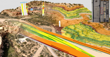
Aveillant is a start-up based in Cambridge with a new radar technology that enables differentiation of objects based on height – in effect a 3D radar. Where this technology can help is with airports threatened with wind farms, which can interfere with control tower radars trying to distinguish between incoming aircraft and nearby wind turbines. John Allen enthusiastically explained the technology and how it can help wind farm developers to counter planning objections from airports, which have statutory rights of rejection to certain developments within 35km of a runway. Meanwhile, his colleague Ben Tilley reported on how they were using ArcGIS Online to analyse wind farm planning applications likely to threaten airports. For an in-depth look at this application and just how quickly and easily Aveillant used GIS turn to page 10.
This interesting and educative day ended with a plenary that looked at the immediate future. Dominic Stubbins talked about the challenges of Big Data, with which we must grapple if we are to solve problems like climate change and mitigate the effects of natural disasters. The data sources are growing rapidly. There are now at least 40 billion connected devices (your car alone may have up to 100 such sensors) including 6 billion mobile phones, many of which are the channel for the currently 15,000 credit card transactions per second. Analysis tool of choice for this data is currently Hardoop, which Esri can accommodate.
But yet more data is coming, warned Stubbins. Direct streams to clients like real-time visualisation will massively increase the flow. Help is at hand from NoSQL databases better able to cope with this variety of sources. As an example, he showed us a story map of the Twister Dashboard that looks at tornadoes and storms across North America. The message fortunately, according to Stubbins, is that big data is getting easier.
Festival Whets Appetites
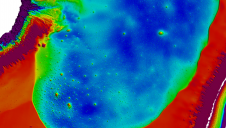
Charles Kennelly, Esri UK’s chief technology officer, then described what he called ‘a festival of releases’ to whet users appetites. Every three months ArcGIS is updated with a full release coming annually. Promised soon is a better Map Viewer and improvements to analysis, organisational management and security, web application builder and increased capacities for open data. You will also be able to make your own base maps and there will be full vector base maps – not just individual tiles. These tools can enable many applications; some can even save lives. Together with 3D graphics we were shown avalanche probability on slope faces in the Alps while another app demonstrated what most politicos already know: support for your party is never an even spread demographic; demonstrated by comparing support for Obama and Romney against geographical distribution of voters.
The day closed with a series of awards delivered by Esri’s director of customer success, Peter Lyon. The best conference paper alas went to one not covered by this reporter. We will try to bring you more on the Marine Information System, developed for the UK’s Marine Management Organisation, in a future issue.
This article was published in GIS Professional August 2014
Value staying current with geomatics?
Stay on the map with our expertly curated newsletters.
We provide educational insights, industry updates, and inspiring stories to help you learn, grow, and reach your full potential in your field. Don't miss out - subscribe today and ensure you're always informed, educated, and inspired.
Choose your newsletter(s)