Is Cartography Dead?
Kristin Warry speculates on the relative importance of cartography as everyone has access to visualisation tools – including mapping tools – and as the amount of geographically related data proliferates exponentially. Kristin would like anyone to enter for the AGI’s new ‘Best Geospatial Visualisation Award’ – whether or not they produce a map!
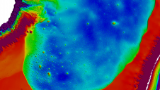
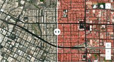
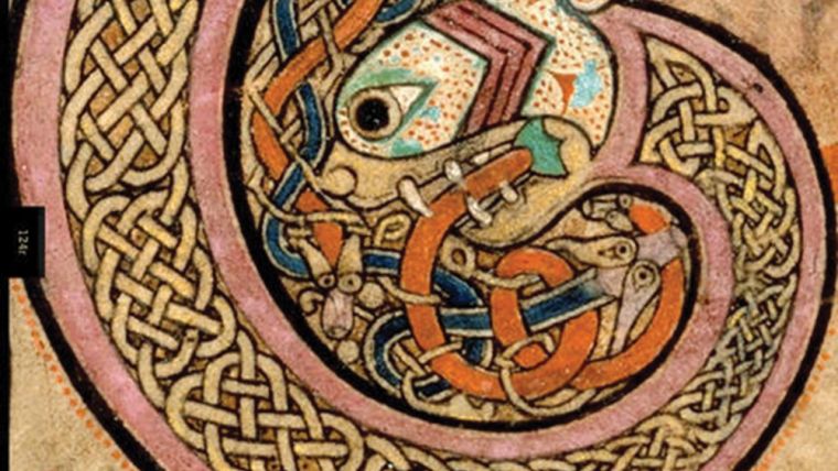
Once, like the illuminated writing in the book of Kells, only a few people could make a map: they drew it painstakingly by hand, and not many could read or use it. Even a decade ago many legal maps were still drawn by hand; the cartographer sat at a drawing board by the window with an array of paints and measuring tools. Then came the digital revolution, followed now by free GI systems which are arguably better in many ways than their expensive proprietary predecessors. Anyone can now print a map in any way they choose and, sadly, like the early days of cheap printing, many of these maps are the equivalent of the Victorian penny dreadfuls! This often means that cartography has been devalued into simple graphic design at best, and primary school artwork at worst.
However, I am still surprised at the number of us who continue to battle with GIS software to display data instead of pulling back and thinking, what else could I use here? Woe betide anyone who tries to publish a map that looks as if someone just threw up – the digital equivalent of alphabetti spaghetti – over a raster background. And yet, so many people still do this. Just search on line for ‘bad maps’ and see the many blogs and websites moaning about cluttered maps with many symbols and no legend, or overlapping symbols of misleading sizes. One book that helped me to understand this was Stephen Few’s “Now you see it” and his website www.perceptualedge.com has a library of free papers about, amongst other things, our irresistible fascination with all things circular. Why DO we use pie charts and circles to quantify things when humans have great problems distinguishing the relative difference in their sizes? Sadly though, bad maps are as old as bad literature.
Not only are the style of maps changing – often for the worse; the quantities requested are also changing – downwards – over the last decade. As a typical GI manager where once my team would have printed many maps every week, we realised recently that the GI team had not printed a single map in a month between us. While earlier this year I had a whole month go by without opening the GI system! Looking round, the only map being opened regularly was the embryonic new internal universal GI system from Astun Technology, based on those same open-source GI systems. This wasn’t even designed for the GI team to use, but for others.
What was causing the programmer most pain? Trying to get the layers set so that users could choose their own display preferences at will! The reason for this was to help those with colour blindness but – and it is typical of current progress – that we (the GI team) don’t bother now with colouring or setting a theme for any data, we just save it for others to play with as they see fit. In any case, with the proliferation of available datasets it would be quite impracticable to set a theme for all of them. For example, CAD users like strong black and white outlines; others like a background map so pale that it almost disappears.
So, drowning in datasets, we are now moving away from the map. When you want, urgently, to find patterns that may or may not be geographic or demographic, it is much faster to just attach a general location and demographic type before pushing everything into the modelling tools in your spreadsheet and watch the multiple chart displays change as you click parameters on and off. You may need a GIS for the first bit, but then it’s over to the other systems. But that’s where the next problem kicks in – spreadsheet display functions are very limiting.
Several years ago I surprised people by saying I never took maps to initial project meetings any more. The same people may now find it hard to believe I hardly ever give them any maps at the end of their projects either! Instead I tend to provide a set of presentation slides - often including imported images made in other data visualisation systems. I may add a quick note at the bottom, but usually I don’t. That way the story is simple enough for them to add their own narrative when presenting their decisions based on the data provided. And this is where it’s getting fun.
There are a lot of bad data visualisations, many of them from graphic teams who have been told to provide an “infographic” without being given much data, so often it isn’t exactly their fault. For examples of great visualisations take a look at www.informationisbeautiful.net. A real classic on that site is the Billion Dollar-o-gram. A picture that tells enough of a story to haunt you for years afterwards is a truly wonderful object.
So what about the new AGI awards? Various ideas were floated past the judges and I certainly appreciated the new ‘cross sector’ approach, but my hackles rose at the suggestion for a “best map” award. Fortunately, I wasn’t alone in feeling that this was woefully inadequate for today’s world of geographic information and so the new award for “Best Geospatial Data Visualisation” was born. We feel that only by leaving this so open will we encourage the freshest ideas to he submitted. That’s not to say that a map won’t win, but it’s not saying one will either. I am really excited at the idea of seeing the first round of entries. They could be from a student whizz kid; or someone with decades of experience. All (!) that is required is the ability to take some massively complex data, with a GI context, and distil it into a simple, compelling, picture.
So, with all this in mind, is cartography truly dead as a science? I think there will be strong opposition to this challenge – so many in the industry have come through years of geography and cartography at school and university. However, the number of people like myself who are using GI every day but who don’t have a single geography or GI qualification are on the increase. I believe that a good understanding of data analysis and a flair for presentation is often sufficient for many of the positions available, particularly in the public sector. Unlike the 80’s when everyone was supposed to take one humanities subject to O level, leading to fights with those, like me, who refused to do so, they are sidelined and completely optional. IT is compulsory, and so are religious education and citizenship, but you can leave maps behind from age 13 with ease.
Whatever your views, hopefully you all agree that it is an exciting time to be in this industry, and that the large and growing number of ways to display data is a positive trend. There are so many inspiring examples every day in the news where once statistics were hardly mentioned beyond the football pools!
The awards will be presented on 13 November at the closing dinner for AGI GeoCom14.
This article was published in GIS Professional August 2014
Value staying current with geomatics?
Stay on the map with our expertly curated newsletters.
We provide educational insights, industry updates, and inspiring stories to help you learn, grow, and reach your full potential in your field. Don't miss out - subscribe today and ensure you're always informed, educated, and inspired.
Choose your newsletter(s)