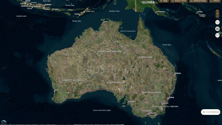
Data Visualization Helps Manage Australian Drought
CSIRO has combined a broad range of data sources to build an interactive data visualization resource to facilitate better management of Australia’s ongoing drought crisis. With this in mind, the CSIRO team has been working with the Joint Agency Drought Taskforce to collate data for the National Drought Map, built on their Terria platform.
The tool combines over 70 data layers in 14 categories, including weather condition data, government drought support, satellite imagery, health services and facilities, demographic data and agricultural industries.
Rainfall patterns, soil moisture, government assistance availability, estimated resident population, number of farm businesses, agricultural types and employment by industries can all be combined on the map.
It is intended that the tool be used to help coordinate assistance more effectively, using data to illustrate what is happening in a local area and to identify accessible services in that region.
Value staying current with geomatics?
Stay on the map with our expertly curated newsletters.
We provide educational insights, industry updates, and inspiring stories to help you learn, grow, and reach your full potential in your field. Don't miss out - subscribe today and ensure you're always informed, educated, and inspired.
Choose your newsletter(s)